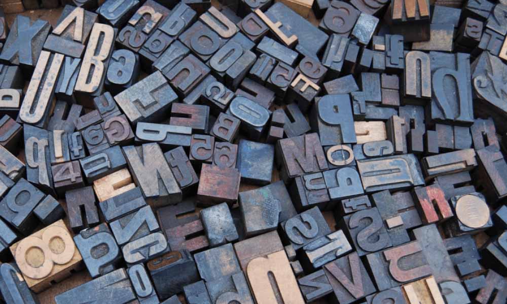
The digital world has a spokesperson as typography. Nevertheless, typography had its emergence a long time ago. It has contributed a significant role in creating a lasting impact for the brand when converted to visuals when made for digital appearances. We are categorizing our blogs to discuss the typography in the vigor of a graphic designer, starting from the basics.
Typography has been performed in varied fields and is used for diverse purposes; we are here to focus on a graphic designer’s perspective on how it influences their performance. How is the skill set affecting the visuals and, ultimately, the brand?
What is Typography?
Typography is the craftwork of sounding an idea in a readable and artistically-pleasing composition. No fonts are devised; instead, they are utilized and altered from the existing type. Depending on the purpose typography is used for, skillful of actions will give recognition to the purpose it is created for. It involves the font class, appearance, structure, alignments, and all those things that relate to a design.
In all, typography is the craftwork you create with the message in the build of text. Nowadays, the most associated typography is digital fonts; however, hieroglyphs, signwriting, calligraphy, are all formations of typography.
It is an essential characteristic of writing so that others can apprehend it effortlessly; unlike symbolic language, programming codes, which are meant for a slender audience. And for that reason also, typefaces have to be uniform and readable.
Typography in the Life of Graphic Designers
Graphic designers use texts with the help of typography to craft the design ecstatic, purpose-driven, and feasible. As much as a designer designs graphics, they also have to undergo a series of actions for typefaces or fonts with a little extra effort and decisions that make a perfect combination of a design and texts. Typographic is one of the skill sets a graphic designing company would seek in its team in order to give an impactful text format.

Source: Pinterest
Important Terms of Typography Known to Graphic Designers
Typography in itself is an entire concept that includes several complex terminologies and definitions. Also, the evolved methods and technology to use terms that hint at the requirements.
Hierarchy
As the words are used, hierarchy is arranging the text according to its significance. It helps a reader to know where to start and what is critical to read in a design. It includes text size, sequence, color shade, or some other similar aspects.
A designer should have a clear picture of a design and categorize what they want a viewer to notice. With hierarchy, a designer can ensure that a viewer at least reads this text, which may or may not convince them to read further.
Typefaces and Fonts
Typefaces are a group of symbols, digits, and letters that are of an identical design. In graphic design, typefaces of particular styles that choose to express emotions have a positive effect on a design. Some examples of typefaces are Serif, Sans Serif, Script, monospaced, and display. Fonts are typefaces expressed with different sizes, heights, widths, and formats.
Leading
Leading is the vertical distance between the two lines of the text span. It is often expressed with the leading value, the number that defines the spacing. Ideally, a leading value has to be more than the font size.
Tracking
The space doesn’t just matter between the two lines or several lines. Spaces also matter between the characters of a text, the term which defines this is called Tracking. One can also express this as character spacing or letter spacing in simple language.
Kerning
Kerning also spacing between characters, but it is not consistent through a design, line, or text. Instead, it focuses on the spacing between specific characters, different in the entire word course.
Alignments
Alignments are a proper arrangement of the text in a design that unifies the texts and lines with specific sizes and justifies those for appropriate understanding. Alignments can be of symbols or texts and could be of queues of texts, words, and other relying graphics.
All these terms may not be new to a graphic designer as many of them are principles of designs subject to the entire design process. However, the purpose of mentioning these terms here is relatable to this specific category.
How is Typography Important for Graphic Designers?
Graphic designers use typography to give purpose to the design with the help of texts. It is a series of steps and decisions that a designer has to take while applying typography in their designs. The most important factor a designer has to justify is that a design with the text has to make sense. It is not just writing a message; a designer has to make it look that expresses the news without much effort.
A designer aims to create a visual impact on a person’s mind with the design, and typography is part of the entire case if there exists text in the design. It is important the design is expressed meaningfully with the texts.
Everything needs exertion and dedication. Typography needs that too. Moreover, typography is the heart of the design. The purpose of graphics is to say your message with visuals instead of content, but the visuals themselves cannot give a specific idea about the message. Here comes in the picture the importance of texts, and that ultimately leads to the typography incorporated in a design. Here is the significance of typography for graphic designers.
Easy to Read Easy to Remember
The brain loves looking into pictures rather than texts. For a person, visuals take 13 milliseconds, almost like in the blink of an eye, to capture it, as per a study. But in some cases, texts are significant. So here comes into the picture to merge the texts with the design making it a persuasive visual. Typography is converting penned text into appealing visuals.
Builds Brand Recognition
Great typography is used for any of the forms like in a website, logo, flyers, in any form that comes into your mind. Designers can use a unique style of typography that resonates with a brand’s principle. Here is the Cadbury’s brand that has the sleek and smooth typography that represents its products’ tastes that way.
Influences Decision-making
Texts can also enhance a person’s feelings. One can drive a person’s sentiment by combining text elements in typography. It’s been one of the strategies of a brand to trigger a person’s emotions. Designers can mark some pinpoints of a brand and try to express them with the help of typography. It has the capabilities to reinforce the message of the text.
Give it a Tone
If it is your website, typography plays a major role in that a person stays for an hour or more. Or they could even be the reason for losing the visitors. A proper blend of fonts with hierarchy, alignments, colors, fonts, etc., will represent a desirable tone to the texts. Texts don’t have sound, so they could be expressed with these elements, which give it a hushed tone and ultimately define a brand.
Conclusion
Typography is a substantial facet of graphic design. As we have explored what typography is, how it relates to a graphic designer’s journey, and how it impacts the brand in various forms, including the digital presence. Though the fact the graphic designing has several factors to give importance to, typography carries a worthful amount of volume.


